Five9 Pricing Page
Role: UX Design | UI Design | User Research
Duration: Jan. 2023 - Feb. 2023
Project Overview
The Product
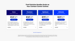
The bundles cards and comparison chart on the pricing page for the Five9 website.
The Problem
The majority of page visitors don’t scroll past the pricing bundles, which is located just below the fold.
The Goal
Redesign the pricing page so visitors view the bundles chart and improve conversions rates.
Understanding the User
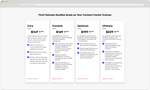
Old Design
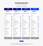
The Pricing Page originally had pricing cards for each bundle with descriptions and bullet points. There was also a separate bundles chart that displayed all the features for each bundle.
Gathering Data
Research
We learned through heat-maps that the majority of page visitors didn’t scroll past the bundles cards.
Hypothesis
Combine information from the bundles chart into each bundle card, so users don’t need to scroll as far down the page to get vital information.
Pain Points (and opportunities)
Scrolling
Too much scrolling is needed to see the bundles information.
Copy
There is a lot of copy in each bundle card, with not a lot of visual hierarchy.
differentiation
There is not a lot of visual differentiation between the bundle cards.
Design
Strategy
Referring to the data, addressing the pain points, and consulting with my team, we decided to do the following:
- integrate the bundles chart information into each bundle card
- shorten the text into bite-size pieces
- make the experience more engaging
Prototypes
Overlapping Cards
In this prototype, only one card would be viewable at a time. Users would have to flip through to view other bundles.
Expanding Cards
In this prototype, there are shortened blurbs and individual features (displayed in list-view) for each bundle card. Add-Ons are not viewable until clicked.
Compact Expanding Cards
In this prototype, only the shortened blurb and CTA button can be seen, while all the features are not viewable until clicked.
Refinement
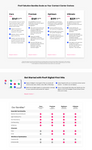
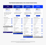
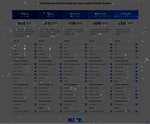
Expanding Cards (v2)
View:
when browser width ≥ 1600px
View:
when browser width < 1600px
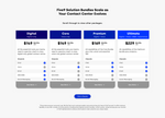
This prototype improves on previous versions by having the following:
- a shortened blurb and price, which are prominently located at the top of the card
- the features for each bundle are horizontally aligned so they can be easily compared to one another
- on desktop, the full length list is shown, but on smaller browser widths only a subset of rows are shown; the user needs to click the CTA to view additional rows
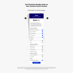
Heat-maps
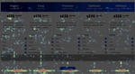
These heat-maps* verify that visitors are clicking to expand the pricing cards and the single “Get a Quote” CTA.
*Screenshots for these modules were taken after the addition of a fifth pricing card.
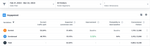
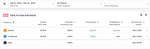
A/B Test Results
The following data show the results for an A/B test conducted in VWO between the control and the v2 design variation:
- an increase (3.32%) in engagement
- an increase (0.90%) in visitors that completed a form (Thank You Page Submissions)
Takeaways
What was learned
I learned that making something more interactive doesn't necessarily create a better user experience. In fact, it can take away from the user experience if it's neither intuitive nor within the appropriate context.
Impact
The new design created an increase in engagement and form submissions in a one-month period.
Next Steps
Continue to monitor web page data.
Create more iterations if needed.


