Icon Development
Role: Brand Designer
Duration: May 2023 - Mar. 2025
Project: Freshservice Icons Update
Currently IT and Facilities uses Freshservice as an ITSM system (IT Service Management System) to provide services to Five9 employees. The Platform is now growing and becoming more of an Enterprise Service Management System (ESM).
The Problem
- 10 new HR Teams will be added to the portal so it needs to look less IT-centric
- The current design is part of the Freshservice platform so backend changes are limited
The Goal
- Help renaming the tiles and add descriptions that illustrate the services better
- Redesign icons to reflect current brand (modernize) and be less IT-centric
- Add new hero image to page
Iterations
Round 1


Approach summary:
- The names were updated based on their service/use-cases
- Simpler linear icons were used to match our current brand guidelines
- Color was removed to focus user attention on the task and not be too distracting
Round 2


Approach summary:
- Feedback was given to eliminate one icon set
- Colors were changed to reflect our dominate brand color being Royal Blue
Round 3

Approach summary:
- Feedback was given to remove blue background and revert to white
- Color should be used to differentiate the icons from one another and add dimensionality
- Implement combination of icons to further illustrate the task that each link title represents
Final
Approach summary:
- Feedback to use light blue (a brand color) instead of color differentiation
- Place mini icons in the same place for each title
- Remove tiles and add animation which reveals description for each title
Project: Five9 AI Toolchain
Currently the Five9 AI Toolchain demonstrates a proprietary process that uses a contact center’s data to deliver a rich and tailored experience to its customers.
The Problem
- There are more detailed steps in the process that are not illustrated in the current model
- The design does not reflect our current brand colors, icon style and looks outdated
- It does not effectively show that it is a cyclical process
- The step titles will change
The Goal
Create a unified graphic that illustrates the four steps of the Five9 AI Toolchain.
Iterations
Round 1
Approach summary:
- A spiral graphic was used to illustrate the cyclical action of the Five9 AI Toolchain
- The pattern represents the continuous flow of data into each step
Approach summary:
- A spiral graphic was used to illustrate the cyclical action of the Five9 AI Toolchain
- The pattern represents the continuous flow of data into each step
Round 2
Approach summary:
- Feedback was given to eliminate the first option and rotate the arrows 45-degrees
- A cog was used to represent “Data” in placed of “Data” an inner circle/separate cycle
- Icons were added to each step
- A second outlined version was added
Round 2
Approach summary:
- A different approach to an arrow graphic was used
- The text components were placed in more pronounced circles
Round 3
Approach summary:
- Feedback was given to rotate the arrows 45-degrees
- Title and descriptions were refined by subject matter experts
- Icons were updated to match new titles
- 2-tone color was implemented
- “Data” was removed from cog
Round 3
Approach summary:
- Text was stylized further to reinforce hierarchy
- Title and descriptions were refined by subject matter experts
Final
Approach summary:
- The first version was selected and feedback was given to implement a blue-green gradient
- Versions for light and dark backgrounds were made
- “Data” was changed to “CX Data” and three subdivisions were added
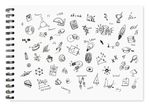
Project: Icon Library
The Five9 icon library is used in all customer-facing communication and marketing materials, including the website, landing pages, PowerPoint decks, and more.
The Problem
As a dynamic company, the applications for icons is boundless. To maintain consistency and ensure a positive user experience, the creative team sought to implement a finite set of brand-approved icons organized into six categories.
The Goal
Implement a cohesive set of icons across all Five9 branded collaterals.


