Mobile Produce App Design
Role: UX Design | Brand Identity | User Research
Duration: Mar. 2024 – Apr. 2024
Project Overview
The Product
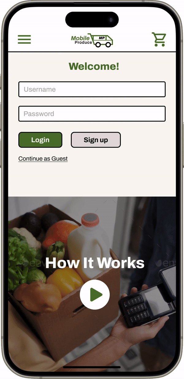
The Mobile Produce App enables people to order and schedule delivery for groceries from a grocery store near them.
The Problem
Currently, for people 65-years-old and older who live alone, physically going to a grocery store to shop can be challenging.
The Goal
Design an app that is usable for its target audience, allows users to create orders and schedule deliveries from local grocery stores.
Understanding the User
Pain Points (and opportunities)
usability
Current apps are geared toward more technology-inclined users.
accuracy
The platform will interface directly with grocery stores’ actual inventory system.
convenience
Scheduled delivery allows users to skip lines and removes them from the physical challenges of going to a grocery store.
Design
Paper Wireframes
I started on the Home Screen because this would be the first screen users would see after logging-in.
I strictly focused on:
- Including only what is necessary
- Ease-of-use
Before
After
As I moved to digital wireframes, I thought having hot-buttons (that were never hidden) and categories to choose from would help guide users what to first. As I iterated, I went to a “blank slate” view to focus the user’s action on building a grocery list.
"My List" screen
After adding items to a list the platform’s software would populate suggestions (based on current inventory) for products.
Prototype
- This is the user flow: adding and selecting grocery items to a list and checking out.
- I also utilized pop-screens to confirm/reject big decisions.
Usability Study Findings
hot buttons
Users were distracted from specific tasks by the hot-buttons that were always showing.
hierarchy
The flat hierarchy did not give enough cues on how to proceed from screen to screen.
differentiation
It was confusing for users to see two different My List screens that had different content.
Refinement
Before
v1
- I removed the hot-buttons and changed the heading to say “Recommendations”.
- I also used color and value to give visual cues for the function of certain components.
v2
At this point, the user’s focus should be on the sub-row that contains product results (with check marks). The goal is to make the item name appear inactive with less emphasis than the sub-row.
Prototype
My hi-fi prototype followed the same user flow as the lo-fi prototype, and included the design changes mentioned previously.
Takeaways
Impact
Users expressed that the design was simple enough to navigate through, complemented by engaging visuals. The list and automation-to-match functionality, “...was neat to see and seems very useful”.
What was learned
I learned empowering users to complete a task is very different process than automating a task.
Next Steps
For even greater usability the app will have an integration through smart home devices or equivalent.
Create a "How To" video guide to lower the barrier of entrance and spread awareness.