UI/UX Design
Role: UX Design | UI Design | User Research
Duration: Aug. 2023 - Oct. 2023
Website Navigation
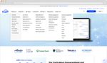
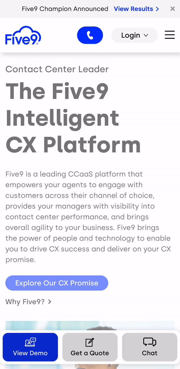
The Product
The Information Architecture and dropdown navigation menu for the Five9 website.
The Problem
Currently, the dropdown navigation menu has a lot of categories and doesn’t feel very organized.
The Goal
Redesign the dropdown navigation menu so it’s easy to find categories and pleasant to use.
Understanding the User
Pain Points (and opportunities)
hierarchy
There is an abundance of items and the categorization is not clear.
experience
Going through the navigation is not a pleasant experience.
information overload
There is too much content that the users sees all at once.
Gathering Data
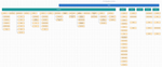
This was the sitemap of the Five9 website at the time of the research study.
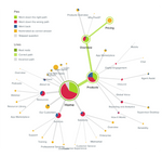
The task given in this tree test was to find the Pricing Page. Because the page was so deep in the sitemap, the majority of users were not able to find it.
Design
Prototypes
Nested Hover (v1)
This version narrows the user’s focus by displaying only "Tier 1 subcategories" that correspond with each main category when hovered on. Additionally, "Tier 2 subcategories" would display only after its parent "Tier 1 subcategory" is hovered on, limiting the content and options shown.
Current
Expandable Subcategories
Usability Study Findings
expanding
For mobile tests, users preferred the menu design with the expanding subcategories over the control (current version).
limit cognitive load
For desktop tests, some users also reported preferring seeing less at once when it comes to categories and subcategories.
Show all information
However, some users like seeing all the options at once to guide them through topics.
Refinement
Nested Hover (v2)
Nested Hover (v2)
This version improved on v1 by having the following:
- "Tier 1 subcategories" that had dedicated webpages (and separate links) are distinguished from other subcategories with underlines
- The pop-up menu displays above the navigation bar (like the original design)
- A hover state (shadow) was added to both "Tier 1 and 2 subcategories"
Takeaways
What was learned
I learned that less information can improve a user’s experience when the user knows exactly where to go. If the user wants to browse, however, having all categories and options shown at once gives guidance on how to navigate through the Five9 website.
Impact
This design has yet to be implemented.
Next Steps
Adding promotional areas for unused space in both desktop and mobile versions of the navigation menu.
Adding iconography to help distinguish categories.
Determine if other parts of the navigation menu can be de-cluttered.


