SnackTime! App Design
Role: UX Design | Brand Identity | User Research
Duration: Dec. 2023 – Feb. 2024
Project Overview
The Product
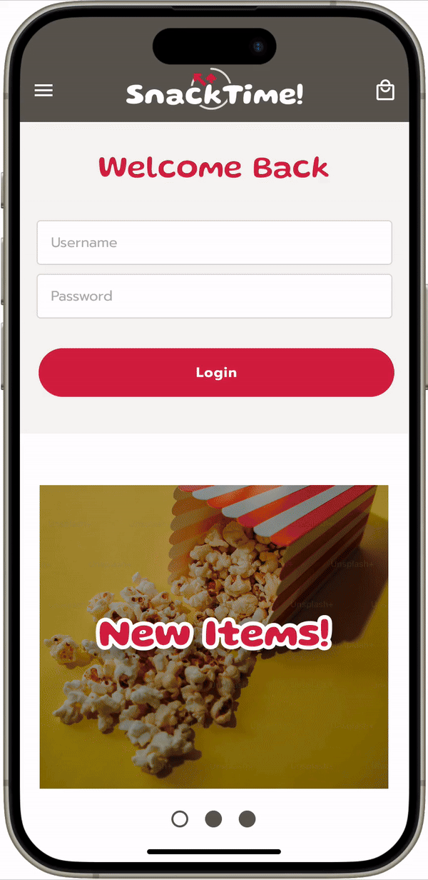
The SnackTime! App enables people to order food, snacks, and beverages ahead of time from a selected movie theater.
The Problem
Currently, the only way to purchase and order food, snacks, or beverages from a movie theater is to go through the snack bar area, which can have long lines and overly high pricing.
The Goal
The SnackTime! App allows users to set-up a time to pick-up their orders without having to wait in a line.
Understanding the User
Pain Points (and opportunities)
Value
Food, snacks, and beverages are often overpriced at the movie theater.
experience
Buying snacks at the movie theater is often an afterthought and not a pleasant experience.
efficiency
The lines at the movie theater snack bar can be long, time-consuming and frustrating for most in this digital-age.
Design
Paper
- I focused on the Selection Screen because it has the most content – and the most important content
- I placed stars next to components that I thought were most effectively built
Digital
- For the Selection Screen, the snack categories are organized in tabs and downward scrollable – which was more intuitive than sideways scrolling
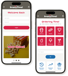
Prototype
The user flow that I created simulated:
- A user logging in
- Choosing a location
- Adding an item to the cart
- Checking-out
Usability Study Findings
Menu
Users were confused when the screen moved from the location page directly to a specific category page.
Pick-up Time
Users got frustrated when they had to choose a specific pick-up time, in an individual process for the flow.
Check-out
During the checkout process, users got lost and frustrated because there were so many steps and they couldn’t tell how far along they were in the process.
Refinement
Before
After
- After selecting a location the next screen is a “menu hub” where they could choose a category, use the search function, ect. This was missing in the wireframes.
Before
After
- To make the flow easier, I created a Check-out screen that integrates location, pick-up time, payment and order summary.
Prototype
My hi-fi prototype followed the same user flow as the lo-fi prototype, and included the design changes that were mentioned above.
Takeaways
Impact
Our target users shared that the design was intuitive to navigate through, impactful through engaging visuals, and the user flow had sufficient cues to complete the task.
What was learned
I learned that having the right balance of elements (essential and subconscious), on a screen is key in guiding the user and creating an engaging experience.
Next Steps
Conduct follow-up usability testing on the new App design.
Some users commented that the brand colors looks like other brands. So exploring other color palettes could help set this App apart.
Identify any additional areas of need and ideate on new features.