Wedding Invitation

Role: Lead Designer & Illustrator
Duration: Mar. 2016 – Apr. 2016
Project Overview
Background
In 2016 Jamie and Mike asked me to design their wedding invitation for their upcoming wedding. Jamie and I have been friends since junior high, so I saw this as an opportunity to finally give back to someone that's given me so much over the years.
The Problem
Create a wedding invitation for Jamie and Mike’s wedding.
The Goal
Make sure the couple is represented in the wedding invitation and happy with the result.
Understanding the Audience
Requirements
fun
Overall, the wedding invitation had to look fun. Jamie and Mike are always fun to be around and wanted folks to look forward to this very special event.
cityscape
Some kind of cityscape theme needed to be included. Jamie works as a city planner and they also wanted to include NYC (where Mike is from) and San Francisco (where Jamie is from).
USER FRIENDLY
It needed to have logistical content, and I didn’t want to compromise basic usability.
authentic
The couple wanted the wedding to match their personalities.
painting
The couple wanted to include a portrait of them done by one of Mike’s friends.
Doing Research
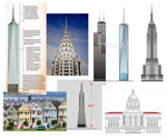
I started by collecting imagery of recognizable and iconic buildings in NYC and San Francisco.
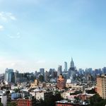
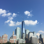
I even went out in the field and took my own photos for reference and inspiration (since I was living in NYC at the time).
Design
Drafts
Illustrating

Illustrating
After selecting which buildings to use, I created digital illustrations in Illustrator.
Custom Typeface
Along the way, I decided to create a custom handwritten typeface. I thought it would add a pop of familiarity, fun, and make the invitation unique.
Custom Typeface

Along the way, I decided to create a custom handwritten typeface. I thought it would add a pop of familiarity, fun, and make the invitation unique.
Layout

Layout
Next I worked to figure out a layout with all the components and text.
At their request, I showed this as a work-in-progress to get some feedback from the couple. Read below to learn what they had to say.
Feedback
illustration style
It was not exactly their style. It looked too realistic.
too busy
There’s too much going on between the illustrations and the text.
colors
The colors were not fun or expressive of their personalities.
Mike's Sketch
I completely agreed with their feedback and took a step back from designing.
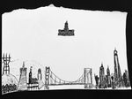
That weekend, when they were out for dinner, the groom sent me a quickly-drawn sketch of how he wanted the buildings to look like – and it really clicked!
It was a "eureka moment" where he showed me how to use the cityscape as decoration instead of a focal point.
Mike's Sketch
I completely agreed with their feedback and took a step back from designing.
That weekend, when they were out for dinner, the groom sent me a quickly-drawn sketch of how he wanted the buildings to look like – and it really clicked!
It was a "eureka moment" where he showed me how to use the cityscape as decoration instead of a focal point.
Refinement
Final Version
Final Version
Thanks in so small part to Mike’s drawing, they loved the next iteration. This version did the following:
- simplified the illustrations to 2D objects and used them as decorative elements
- pulled colors from the painting on the reverse side
- created hierarchy by rearranging the three locations in distinct areas of the layout
- made the dual bridge and city hall illustrations as focal points
Takeaways
What was learned
The biggest takeaway I got from this project was sometimes taking a step back and allowing someone else to lead can yield a favorable outcome.
I also learned that executing in the details (like I was obsessed with doing in illustrating the buildings) could be a detriment to the project as a whole. So, truly understanding the objectives outweighs any detail and should remain at the forefront of all decisions.
Impact
Jamie and Mike loved the wedding invitation and, to this day, it's something I am proud to be a part of.
The devil is in the details.
The hard lines and dark shadows help represent the bold personality of NYC. This is contrasted by the sprawling and varied cityscape that is San Francisco – with all its quirks and iconic fog.


